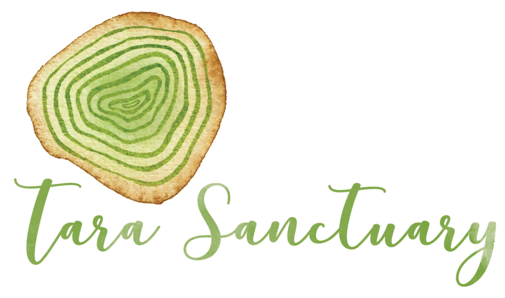
New Logo for Tara Sanctuary
Here is our new logo for Tara Sanctuary. It’s been quite a process to get here! It was created by Liz Verde, Bristol designer. We said the most important thing to convey was a sense of ‘life and death held together, in relation to each other.’ We also wanted it to give a sense of natural beauty, refinement, ‘bespoke hand-made’, sensitivity, warmth, and gravitas, and to induce confidence!
We’d actually gone through a whole process, with Ryan James and designer Peter Simon, to get to this stage of having a clear brief. Ryan, who is part of our team and has expertise in marketing and branding, explained that actually a huge part of this kind of design process is getting a proper brief, ie actually getting clear on the essence of what you are about, what you want to convey through your logo and branding.
A while back we had a team meeting where we’d looked again at our mission statement, and this idea of death in relation to life was the strongest thread. It runs through all the different elements of the project. You could say the natural burial movement is all about having a life-affirming relationship to death; as opposed to death being hidden away, negated, taboo. I was very struck by a comment by Kirsten Kratz (teacher at Gaia House). She said that ‘denying grief is life-denying’. So embracing grief, embracing the reality of death and dying is life-affirming. Developing the burial site to become a nature reserve – a haven for wildlife and biodiversity – is also life-affirming: death leading to new life. Also, the retreats we have on the land will – I hope – address our denial of impermanence and death, in order to wake up to the preciousness of human life.